Designing Outdoor Advertising
5 tips to ensure it works for you
In order to receive maximum impact and value for your investment, below are some important steps we encourage our clients to follow when designing the content of their bus shelter ad.
1. SHORT AND SIMPLE
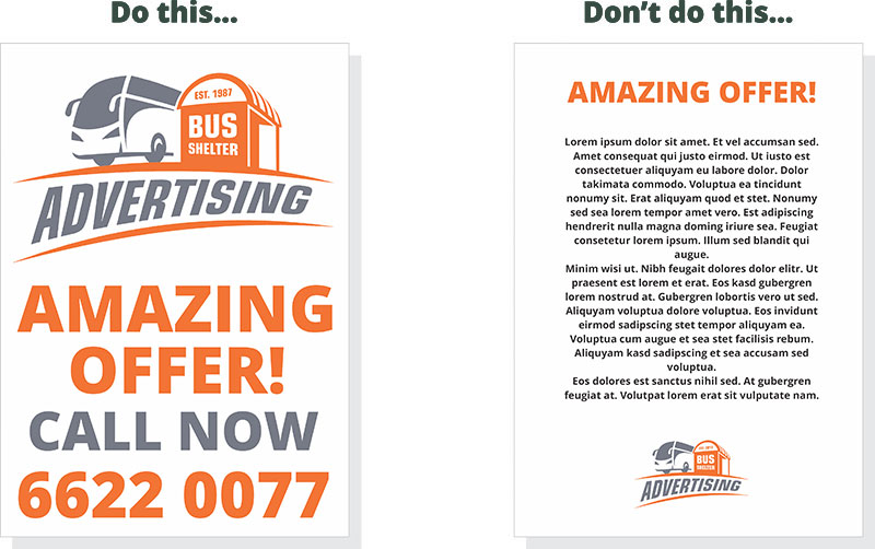
We recommend a maximum of 7 short lines of text with a minimum amount of words to convey your message. Focus the essence of your message into clear and simple ideas such as WHO, WHAT and WHERE.

2. LETTERING AND FONT CHOICE
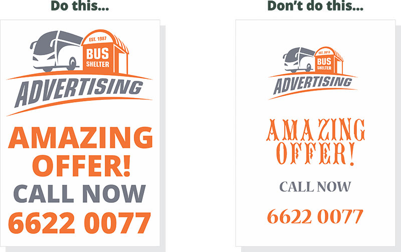
Always use an easy-to-read font style. Avoid lettering that is too wide or thin.

3. USING COLOURS
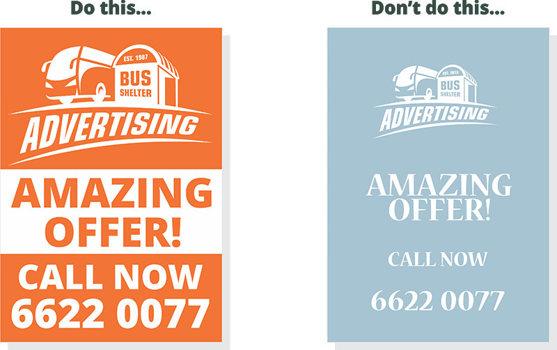
Strong and bright colours work well for wording and numbers. Background colour should contrast with the surrounding environment. Light, bright colours are a good choice for dark backgrounds. Avoid soft, low contrast and pastel colours.

4. SIMPLE DESIGN
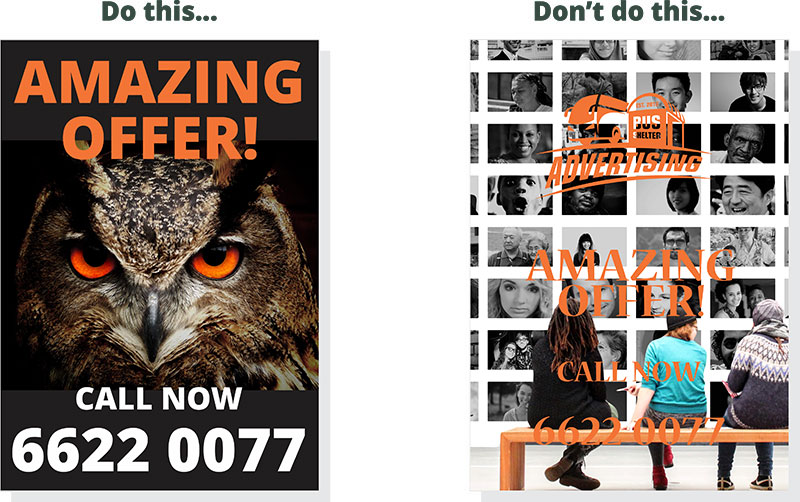
Increase the message’s impact by using striking, close-up images. Avoid complex photographs or graphics that have too many colours.

REQUEST A MAP OF VACANCIES
Please complete this form to receive an interactive map of our available bus shelter locations.
